Designing a wayfinding system may seem straightforward, but even small missteps can lead to confusion, frustration, and lost time for users. Businesses often focus on signs as the solution, but true wayfinding is about creating a cohesive experience across the entire space. When poorly executed, even the most visually appealing signs can fall short of their purpose.
Whether you’re developing a commercial complex, healthcare facility, or educational institution, here are some of the most common mistakes highlighted by SPM Design wayfinding design Los Angeles to avoid during wayfinding planning.
1. Treating Wayfinding as an Afterthought
Many organizations wait until the final stages of a project to think about navigation. By that point, the layout is fixed, budgets are stretched, and wayfinding becomes a last-minute task. This frequently leads to haphazard signage that is inconsistent in both logic and appearance.
Wayfinding should be considered during the early stages of spatial planning. It affects how people interact with the environment, and when designed in parallel with architecture and branding, it becomes a much more seamless part of the experience.
2. Overloading with Signs
Excessive or insufficient information may be harmful. When visitors are met with a wall of arrows, lists, or inconsistent instructions, they’re likely to stop and get confused. Cluttered or redundant signage often stems from trying to fix navigational issues without addressing the system as a whole.
Instead, focus on clarity and hierarchy. Guide users step-by-step rather than overwhelming them with every possible destination at once.
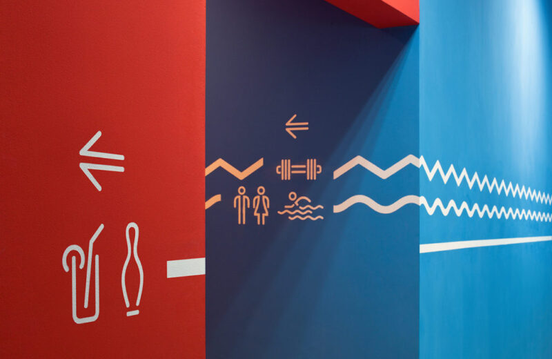
3. Inconsistent Visual Language
Fonts, colors, symbols, and materials all play a role in how well people understand and follow a wayfinding system. When signs look different from one area to the next, users are forced to re-learn visual cues with every turn. This inconsistency slows down navigation and increases errors.
Creating a unified visual language across all elements helps people recognize patterns. Being consistent encourages trust and allows for quicker, more definite decision-making.
4. Ignoring the Needs of All Users
Not every visitor experiences a space the same way. If a wayfinding system overlooks people with mobility challenges, vision impairments, or language barriers, it’s incomplete. Many designs rely heavily on written text, color, or small visual cues that aren’t accessible to everyone.
A thoughtful system takes all users into account. This means considering font size, tactile features, language clarity, and the physical positioning of each element. When designed properly, accessibility doesn’t stand out—it blends in and works for everyone.
5. Forgetting to Test in the Real World
What looks good on a layout or screen doesn’t always translate well in a busy, real-world environment. A sign may be blocked by furniture, hard to spot in certain lighting, or placed too high for people to see in time.
Testing is a vital part of the process. Walk the space like a first-time visitor. Look at sightlines, check for distractions, and observe where people naturally hesitate. Real-use feedback is often where the biggest improvements are found.
If you’re ready to build a functional, user-friendly system that works from day one, SPM Design Wayfinding Design Los Angeles delivers expert solutions that guide people with clarity and intention. Let your space do the talking and save yourself the guessing.